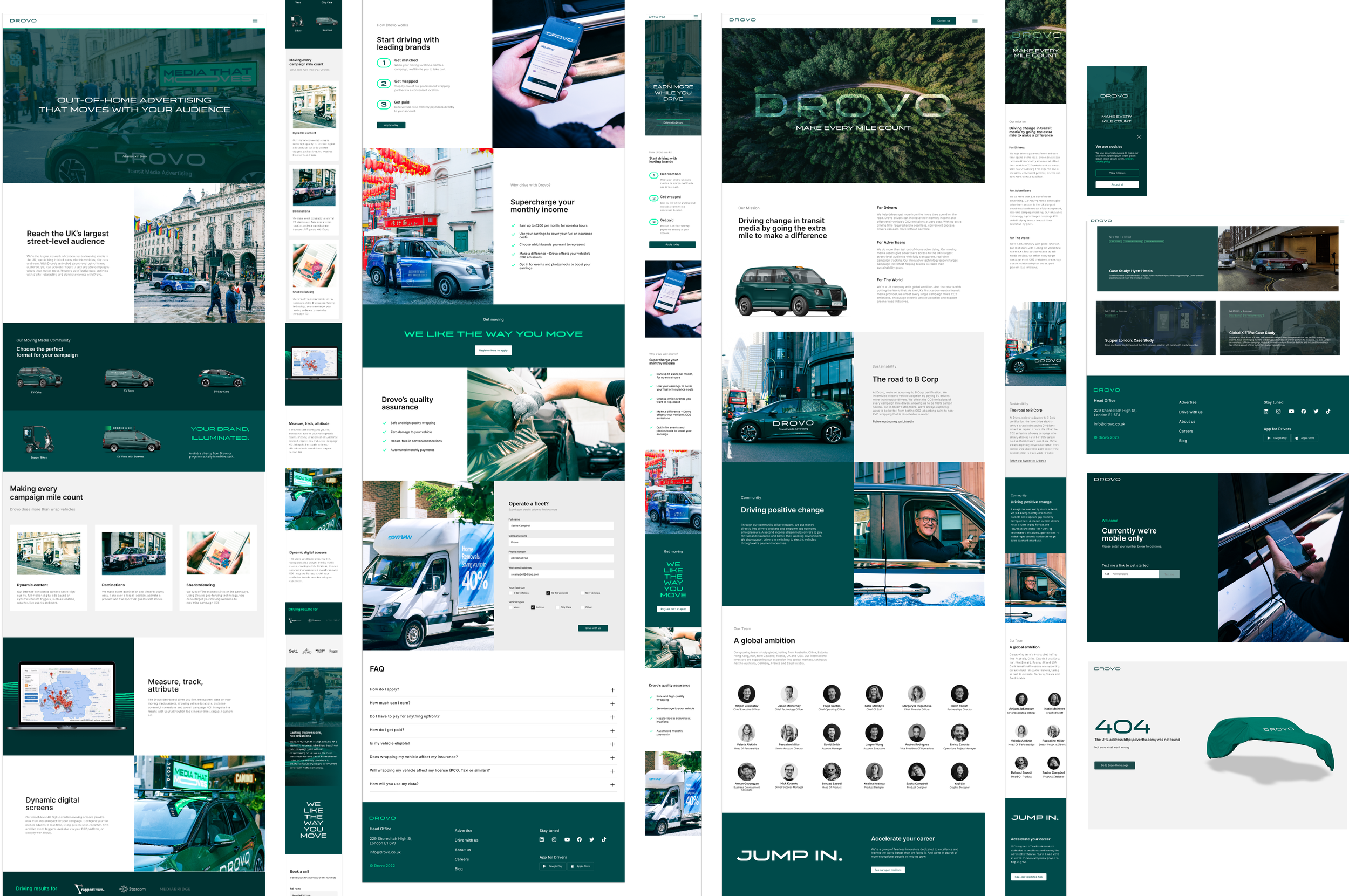
Drovo Website redesign
After Adverttu rebranded as Drovo, it was crucial to revamp the communication approach on the company's website. Additionally, we aimed to learn from the UX mistakes of the old website and ensure they were avoided in the new one, with a focus on acquiring and engaging more users.
The general aim
Our ultimate goals were to significantly increase the number of drivers signing up through the website, increase trust and generate a higher volume of campaign inquiries from advertisers, and enhance overall visual recognition and brand image.
My role
In this project, I assumed a leadership role, overseeing the entire process from inception to delivery. I was responsible for conducting initial research, creating wireframes, updating the design system, and delivering the final UI design to the development team for implementation. I facilitated seamless collaboration between the product team and the brand agency, ensuring alignment with the newly developed Drovo branding and coordinating efforts with leadership and the development team. Additionally, I had the opportunity to mentor a junior designer, providing guidance and support throughout the project.
The outcome
Within just a few months after the website launch, we began witnessing some of the desired results. Drovo experienced a noticeable increase in interest from premium brands, and the acquisition funnels became significantly clearer. We successfully eliminated the issue of drivers signing up as advertisers and not reaching the Drivers app, achieving a more streamlined and targeted user acquisition process.
The average scroll-depth percentage for main landings increased from around 20% to
~75%
Drivers (B2C audience) sign ups via website increased by
35%
Conversion from PPC campaigns for B2B audience increased by around
20%
B2B audience response to proposals after the website launch increased by approx
50%
Project stages
1 Research
2 User Personas
3 Information Architecture
4 Wireframes
5 Final UI and handover
STAGE 1
Research
Sources
Google Analytics
Plenty of data from the old website statistics and experiments
Drivers feedback
(B2C users)
Short surveys on our current (old) website, feedback from our support team - they had website enquiries from time to time)
Advertisers feedback (B2B users)
Personal feedback that we got through our Sales Team.
Revising behavior on our old website
Based on analytics, we came to these assumptions:
Don’t:
A generic landing page overloaded with information for both Drivers and Advertisers.
Multiple calls-to-action (CTAs) with different messaging.
In the past, we encountered a situation where 85% of Advertiser inquiries were submitted by Drivers mistakenly tapping 'Create your Campaign.'
Displaying all our impressive features and technologies to every user.
Presenting excessive and irrelevant information resulted in a low scroll rate, with users leaving after only viewing 1.5 to 2 screens.
Do:
Dedicated Landings and focused experience for each audience.
Clear copy and strategic CTA’s placing
Guiding Drivers towards installing the app and encouraging Advertisers to request campaigns effectively.
Presenting only relevant information.
We are restructuring the website and tailoring the information to specific user categories for a more focused experience.
Competitor analysis
There were no proper competitors in the UK with the same offering. But we considered the following:
Carquids
Operate in the UK, but don’t offer premium advertising or digital tracking solutions.
Driver Landing is primary landing.
Brands and Agencies have clearly highlighted CTA to enter their landing.
They use real life photos of the car, which gains trust.
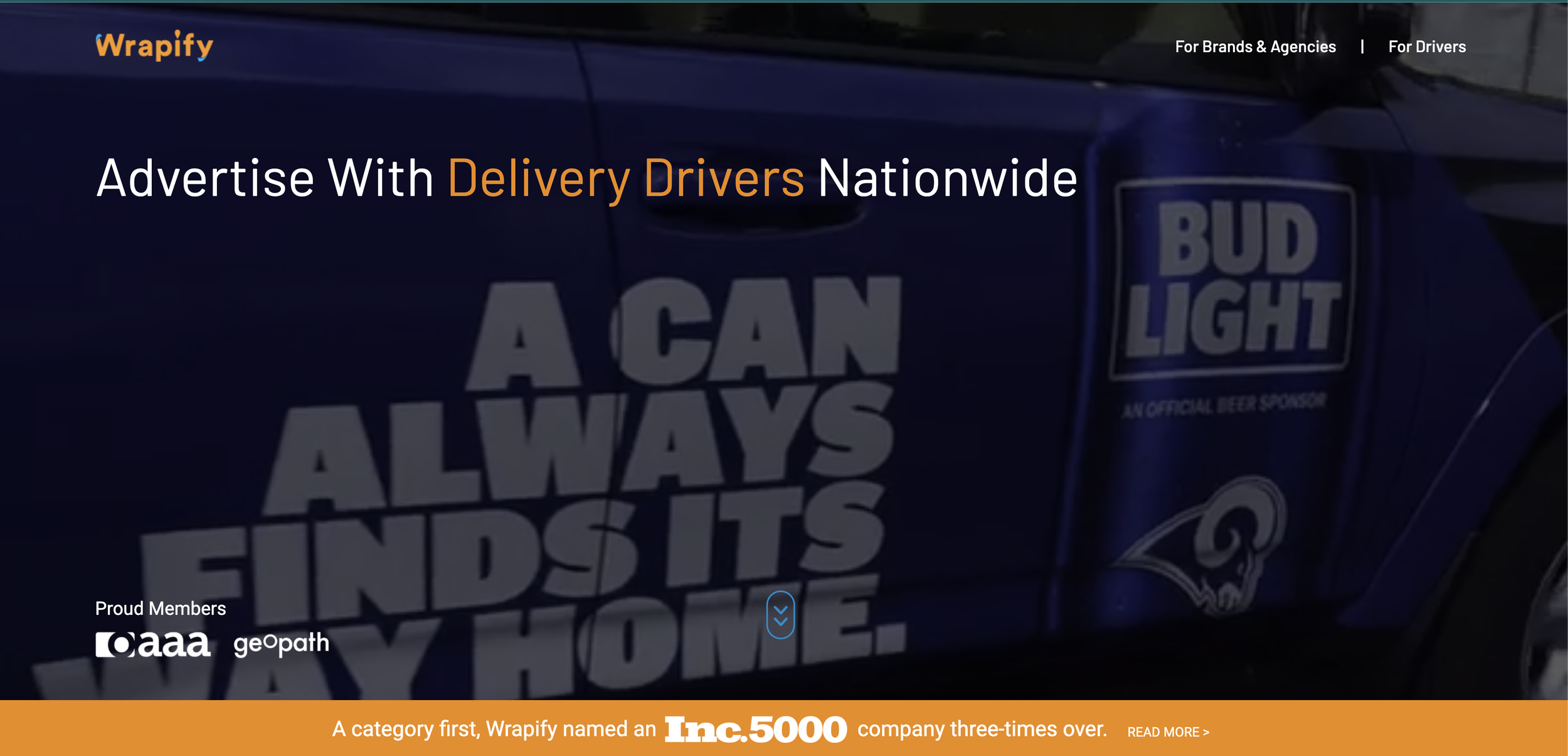
Wrapify
Big in the US and about to enter the UK market.
Main Landing is dedicated to all user categories and various different information about the platform (which Drovo previously had and it didn’t work well).
Real life car photos on main screen
Clear separation for Drivers and Advertisers in the main menu
Lot’s of technology explained for Advertisers (which Drovo also previously had and it didn’t work that well)
Carvertise
Operate in the US
Real-life car photos showcasing delivered campaigns.
Clear separation of sections for Drivers and Advertisers in the main menu and the main Landing Hero section.
Use of simple language and concise information for Drivers, such as explaining the wrapping process with an image and just four checkboxes.
Competitor analysis
Takeaways
To use real campaign photos. Previously we used plenty of graphics and people (both Drivers and Advertisers) considered us Scam with no real campaigns.
Clear separation of Drivers - Advertisers sections.
Simple and common language, especially for Drivers.
STAGE 2
The User (Personas)
We defined following categories of users we consider using the website:
PRIMARYAdvertisers (B2B):
Leadership of startups
Media agencies representatives
In-house marketing specialists
PRIMARYDrivers (B2C):
Individual vehicle owners
Cab Drivers
PHV (Uber, Gett…) drivers with owned cars
Van Drivers (owned or rented vehicle)
Van drivers (rented vehicle)
Small fleet owners
SECONDARYWrapping facilities and Car services (Partnerships)SECONDARYPotential Employees and Investors
A few different Personas based on our Users and their needs. We used them to build the Information Architecture (as well as for the app redesign and marketing purposes) . Here are a couple of examples:
Gemma - one of our Driver PersonasPeter - one of our Driver PersonasAlex - one of our Advertiser PersonasSTAGE 3
Information Architecture
Started with the mind map, based on types of users we aim to welcome on the website:
Mindmap, based on types of users. Some info blocks were decided to be delivered later or in different Media sources (app)Information Architecture
Navigation structure
Based on on the mind map and considering Sales Team insights, we came up with the navigation structure. Black Cabs offer is the most trusted by Advertisers, and they often come across Drovo, searching for on Cab advertising, so we were focusing on this offer for now, at the same time promoting other options as well.
Information Architecture
Landing structure mockup
Here’s the example of the landing structure we were handing over to our copyrighters, together with Navigation structure and the Mind map.
We also provided the new brand guide, existing materials (including website, proposals, Personas, the Research ) and new visuals. We were keeping in touch through the whole process.
Navigation map based on Mind map and prioritiesExample of single Landing structure (Advertisers) based on Mind map and Navigation structure. AKA Content guideSTAGE 4
Wireframes
I will provide a comprehensive showcase of the work process, focusing specifically on the Advertisers Landing page. This approach allows for a detailed and easy-to-follow demonstration without overwhelming the case study with an excessive number of screens and wireframes.
* The very same approach was applied across the entire site, helping the Product, Copy, Sales, Leadership and Dev Teams work fast and be aligned on every step.
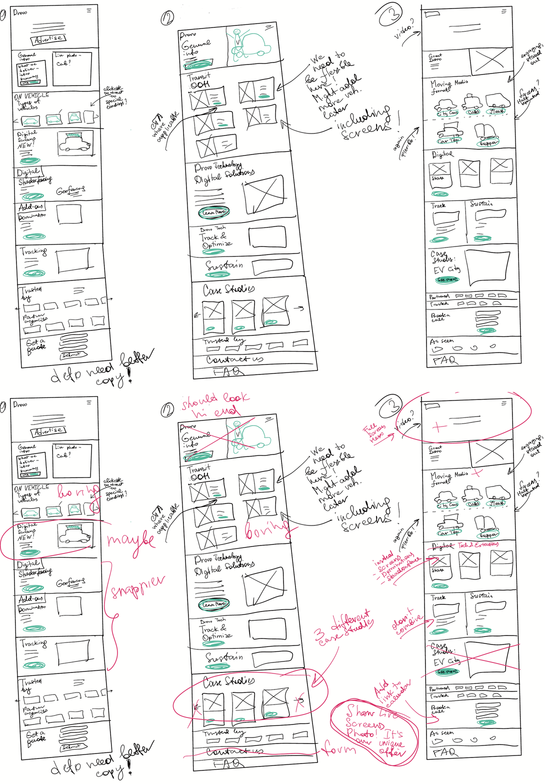
First sketches
We started sketching even before the final copy arrived, meanwhile discussing the approximate visual aspects within the team.
Here’s an example of the team discussion on first sketches (Advertisers landing):
Advertisers Landing sketchesWireframes
Once we finished sketching and received the content from the Copy team, we brought everything together in wireframes. With core brand guidelines already established, I roughly aligned key elements like structure, vibe, and typography at this stage.
The plan was to invest resources into professional photoshoot and videos for the Premium look while keeping the frontend design as simple as possible, considering the limited availability of development resources. As a result, we adopted a block-based approach for the website, reusing the same blocks across multiple pages.
As we had already obtained approved copy and structure during the finalization of wireframes, we were able to provide these materials to the development team. This enabled them to begin laying out the website's framework without waiting for the final user interface (UI), resulting in time savings.
STAGE 5
Final UI and handover
UI and Handover
Basic Design system
I put together the starter pack of UI elements, required for the build of the website. This was the very first iteration which obviously got expanded and adjusted over time.
Here’s the fragment of it.
UI and Handover
Initial UI
Core landings ready, general styles and all the reusable blocks set. Right for the Brand launch party.
UI and Handover
Improvements
In the following months, we introduced additional dedicated landing pages, which proved to be highly effective in acquiring users through online advertisements. These landing pages also played a crucial role in helping users better identify themselves within our target audience. To enhance user clarity and engagement, we replaced the previous landing page with a split-screen solution. The improved separation of user groups has resulted in higher click-through rates on the respective CTAs.
Thank you!
End of the Case Study
-
End of the Case Study -


